Did anyone notice this detail on the rainbow X?

  • Nominations will close March 25th. If you'd like to join the board and influence how TinkerDifferent runs in the next year, put your name in now!
  • Hey Guest, MARCHintosh 2026 is upon us. Check out community projects, join GlobalTalk, and have fun!

🌈NiziMac

New Tinkerer
Mar 17, 2026
11
10
3
JAPAN
By the way, I noticed something interesting on the Maclock sticker,

On the rainbow X, there’s a small boundary between the green and yellow stripes.

名称未設定.jpeg


It made me think about the classic Apple rainbow logo… and suddenly it clicked for me.

Did anyone else notice what’s going on there? 🙃
 

JDW

Administrator
Staff member
Founder
Sep 2, 2021
2,646
2,054
113
55
Japan
youtube.com
LOL. I read it as MAC LOCK, not MA CLOCK. Funny. Yes, I've seen that gizmo before. Never knew about a sticker though. But it raises the question why the sticker is an X.

In any case, the gap in the colors could easily be explained as a Chinese manufacturer saying something like, "See. We aren't copy Apple's 6 colors. We have a gap!" :)
 

ScutBoy

Administrator
Staff member
Founder
Sep 2, 2021
360
345
63
Northfield, MN USA
There's a gap between the leaf and the apple in the real logo, so...

I bought a MaClock from RayCue and it had a logo on the front (that I didn't want). Kokogol.com said theirs didn't have any logo on the front, and they were honest - same hardware, even the same instruction sheet, etc. Just no logo on the front, and some different wording on the box.
 
  • Like
Reactions: 🌈NiziMac and JDW

🌈NiziMac

New Tinkerer
Mar 17, 2026
11
10
3
JAPAN
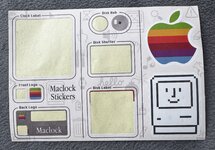
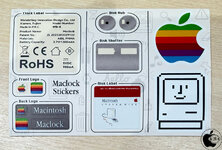
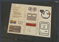
It looks like there are actually two versions of the MacClock sticker.

One is the rainbow Apple logo version, and the other is this rainbow X version.

My MacClock came with the Apple logo sticker.
Sideburn mentioned that his first or second unit had the Apple logo, while the 3rd one had the rainbow X.

ScutBoy, you got it!

The gap between the green and yellow stripes does match the separation between the leaf and the apple in the original Apple logo.

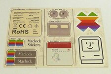
But when I overlaid the X logo with the classic Apple rainbow logo, I noticed something even more interesting.

Several parts line up almost perfectly:

スクリーンショット 2026-03-23 3.09.54.png
スクリーンショット 2026-03-23 3.06.28.png


• the top shoulders of the X align with the round top of the apple
• the upper notch of the X fits the leaf position
• the side indentation matches the apple bite
• the lower V shape aligns with the bottom curve of the apple

So it almost feels like the designer analyzed the structure of the Apple rainbow logo and reconstructed it into an X.

If that was intentional, I think it’s actually a brilliant piece of design.

@Sideburn Your photo actually made me look much closer at the X logo
 

Attachments

  • IMG_9768.jpeg
    IMG_9768.jpeg
    721 KB · Views: 1
  • IMG_9693.jpeg
    IMG_9693.jpeg
    284.9 KB · Views: 1