ThinkC MacDock dev progress -- Like today's macOS Dock but for System 7

Relating to ThinkC Development

MacOfAllTrades

Tinkerer
Oct 5, 2022
168
183
43
4/30 Update -- RELEASED!!:
  1. See Git page at this link
  2. Download the .sit file directly from the Releases page (or direct download here)
---- original message follows:
I filled up a few of the pages in the Study Group 2 thread with questions and progress on this program.

It started as the thought "Ok - I've been through the first 5 chapters of the "Macintosh C Programming Primer" diligently typing in all the sample programs along the way and tinkering with them. But to really practice I have to write my OWN program... now wtf do I try and make?"

After seeing fun reddit post on r/vintageApple where someone posted a mock up of what the Dock might look like in the old System software, I thought that'd be it.

I have it working to switch apps and auto update (though performance tweaks may be in order some day -- it's not at all slow but I can tell it could easily be more efficient).
Possible future enhancements:
  1. make a GUI indication of which item you're hovering over as feedback to the user
  2. Auto hide (maybe with animation for pop up and pop down)
  3. Always float above all windows
  4. Add "Keep in Dock" functionality so that it can have programs (and files!) permanently in there like Favorites
  5. Working About.. box
  6. Make it into an Extension or Control panel if it makes sense
  7. Support System 6
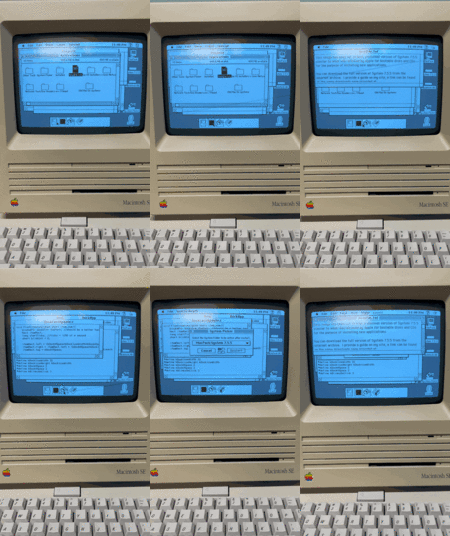
Currently this is what it looks like (the gif is latest and includes blinking, the movie didn't have the blinking but is higher quality).

I have it on a Git repo as well but am not quite ready to share it just I'd like to have it working more before I do)
 

Attachments

  • D80D4EEC-B757-470D-9BAE-FDCA557DDE7B-2.gif
    D80D4EEC-B757-470D-9BAE-FDCA557DDE7B-2.gif
    8.4 MB · Views: 303
  • 12002-d4161cec12a1aca70c2bcf21f17809f3.mov
    4.4 MB · Views: 0
Last edited:

Crutch

Tinkerer
Jul 10, 2022
293
228
43
Chicago
Great work so far!

One more suggestion if you don’t mind:

It looks in the GIF like you have to click twice to switch apps: once to bring MacDock to the front, and again to click the app icon.

Is that right? If so, you could eliminate that requirement by checking theEvent->where when you get a resume event (I believe it’s populated for resume events), and if it’s in one of your icons, going ahead and acting like the icon was clicked. The Dave Mark book should describe how to check for a resume event, I’m pretty sure.
 

MacOfAllTrades

Tinkerer
Oct 5, 2022
168
183
43
Great work so far!

One more suggestion if you don’t mind:

It looks in the GIF like you have to click twice to switch apps: once to bring MacDock to the front, and again to click the app icon.

Is that right? If so, you could eliminate that requirement by checking theEvent->where when you get a resume event (I believe it’s populated for resume events), and if it’s in one of your icons, going ahead and acting like the icon was clicked. The Dave Mark book should describe how to check for a resume event, I’m pretty sure.
I appreciate and welcome all suggestions! Keep em coming.
And yes that’s a great idea. I’ll give it a look. Im interested in any method to help aboid the extra click into the app and this sounds quite plausible.
 

retr01

Senior Tinkerer
Jun 6, 2022
2,473
1
796
113
Utah, USA
retr01.com
Is that right? If so, you could eliminate that requirement by checking theEvent->where when you get a resume event (I believe it’s populated for resume events), and if it’s in one of your icons, going ahead and acting like the icon was clicked. The Dave Mark book should describe how to check for a resume event, I’m pretty sure.

What does it take to use the same action as the pull-down menu to drag down the mouse and release for the proper selection?
 

MacOfAllTrades

Tinkerer
Oct 5, 2022
168
183
43
Ok
Great work so far!

One more suggestion if you don’t mind:

It looks in the GIF like you have to click twice to switch apps: once to bring MacDock to the front, and again to click the app icon.

Is that right? If so, you could eliminate that requirement by checking theEvent->where when you get a resume event (I believe it’s populated for resume events), and if it’s in one of your icons, going ahead and acting like the icon was clicked. The Dave Mark book should describe how to check for a resume event, I’m pretty sure.
Ok got this done! ((recored with mouse click indicators)). I used the Inside Macintosh sectino in ToolBox Essentials that explained it all pretty well and aligned with your recollection.

 
Last edited:

Patrick

Tinkerer
Oct 26, 2021
434
1
224
43
I noticed in the video the icons look like they are being double clicked. (they flash twice)

I feel like in the modern dock they only flash once when you are simply switching to them.

This is really cool and i bet a lot of fun to recreate.

edit: i meant to ask originally.
>Is that flashing twice thing intentional ?
 
Last edited:
  • Like
Reactions: MacOfAllTrades

MacOfAllTrades

Tinkerer
Oct 5, 2022
168
183
43
I noticed in the video the icons look like they are being double clicked. (they flash twice)

I feel like in the modern dock they only flash once when you are simply switching to them.

This is really cool and i bet a lot of fun to recreate.
good point! I'll mess with it and see if the single flash feels good / satisfying. But you're correct the modern Dock on macOS only highlights (darkens actually) when you click on it (and while holding mouseDown) then returns to normal appearance upon mouseUp
 
  • Like
Reactions: Patrick

retr01

Senior Tinkerer
Jun 6, 2022
2,473
1
796
113
Utah, USA
retr01.com
IMHO, the OS X and System 7 behavior should be respected and appropriate for their respective eras. For example, as I explained earlier, when clicking on a pull-down menu in the classic Macintosh OS, drag the mouse down until the desired selection and release the mouse button, in which the highlighted selection flashes multiple times quickly to indicate the choice. It can be the same for the MacDock concept under Systems 6 and 7.

I was trying to convey in my animation that when the Mac sees the mouse on the dock, it will act like the pull-down menu, and then when the mouse button is released over the desired app to run or switch over to a running app.

Options could be made in the MacDock control panel to double-click, drag and release, etc.
 
Last edited:

retr01

Senior Tinkerer
Jun 6, 2022
2,473
1
796
113
Utah, USA
retr01.com
I see these icons as buttons rather than a menu. I think single clicking is more intuitive personally and is also consistent with Apple’s Launcher app of the same era.

That is a valid point, indeed.

Intended for novice computer users or simplifying things such as at a kiosk, the Launcher app started in System 7.0.1P with the Performa Macs. Then, by System 7.1P3, sections could be formed within the Launcher. Finally, the Launcher became standard in System 7.5 and on.

Check out what Apple had to say about the Launcher on pages 57 and 58 in the Macintosh System 7.5 Upgrade Guide.

1682625433058.png
1682625461936.png
 
Last edited:

MacOfAllTrades

Tinkerer
Oct 5, 2022
168
183
43
Good back and forth guys.
i did try the single blink and it feels solid.
I also added code to automatically position the dock at the bottom center of the screen (before it was hard coded to bottom center of a compact mac screen. Heads up to future readers “resolution” meand dots per inch as far as Inside Macintosh terminology is concerned. So the ScreenSize function kept telling me 72, 72 and i thought hmmmmm sounds like dpi. Anyway i got the monitor resolution from the gDevice hbdle returned by GetMainScreen (primary monitor representation as a graphics device)
 
  • Like
Reactions: Patrick and retr01

MacOfAllTrades

Tinkerer
Oct 5, 2022
168
183
43
Anyone know where to point me in creating custom window frames? I’m using a borderless rectangle window from the ResEdit window options but Id like to have a rounded-corner one (not offered as an option as far as i can find). Figured i needed to do some kind of custom deal.
 

Crutch

Tinkerer
Jul 10, 2022
293
228
43
Chicago
Yeah you would need to write your own WDEF for that. It’s not particularly hard but slightly cumbersome and you have to do some things a bit carefully, and ideally to be correct (but not actually necessarily in practice) compile into a separate code resource. I would call it a Slightly Advanced Topic and might recommend saving that for slightly further down the road unless you really want to dive into code resource construction right now.
 

MacOfAllTrades

Tinkerer
Oct 5, 2022
168
183
43
Ok heres the update:
In addition to the earlier post on supporting non-compact-mac resolutions and the single blink, I added an option for auto hide.
Auto Hide isn’t all the way like macOS Dock’s auto hide where it goes all the way away until you mouse hover the bottom (maybe some other day…).
Instead my Auto Hide just drops the dock window halfway when in the background so that when you’re in another app with a bunch of windows covering most of your screen and you maybe have a sliver of visibility of the Dock at the bottom if your screen youll see a more “valuable” sliver of your apps’ icons.
Anyway, default for this option is OFF but heres a video showing without it, flipping it on, and then showing with it.

I’ll probably take a pause on the program after this. Been playing with it a ton every night :). Maybe next week ill pick it up and add more features or maybe move on to the next chapter of the programming book.
Video posted. And as always - Thanks so much for the support & ideas!! You all are the best!